Color Theory for Stage: Dance Costume Colors That Actually Pop
Choosing the right costume color can make or break your routine. Here’s how stage lights change color, what flatters diverse skin tones, and easy pairings from Limelight’s Prima & Elements collections—plus a printable palette checklist.
The quiet score-booster nobody talks about
Two teams run the same choreography. One reads electric on stage; the other blends into the backdrop. What changed? Often, just color. When you understand how color behaves under stage lights—and how to coordinate it across a cast with different skin tones, hair colors, and genres—you get that “polished, professional” bump before the music even starts.
Quick answer (for busy directors)
-
Bright, clear hues and deliberate contrasts read best from the back row.
-
Mid-tone murky colors (muddy mauves, dusted sages) often die under LEDs.
-
Pair one dominant hue with a contrast (either value or temperature) and a metallic/rhinestone accent.
-
Choose a base that flatters skin tones first; layer pattern/embellishment second.
-
Test under rehearsal lighting whenever possible (even a handheld LED panel helps).
How stage lights warp color (and what to do about it)
Stage rigs increasingly mix cool LEDs with warm front wash. Cool light can desaturate warm reds/oranges; warm light can flatten some blues/greens. Black looks sleek up close but can turn into a void on stage; very pale pastels risk washing out completely.
Make color survive the rig:
-
Increase saturation by one step from what you’d pick for photos.
-
Add value contrast somewhere: darker waistband, lighter bodice, or a metallic break line.
-
Use texture/shine (rhinestones, metallic foils) to kick back light at focal points—sternum line, hip angles, cuff accents—so judges’ eyes go where choreography wants.
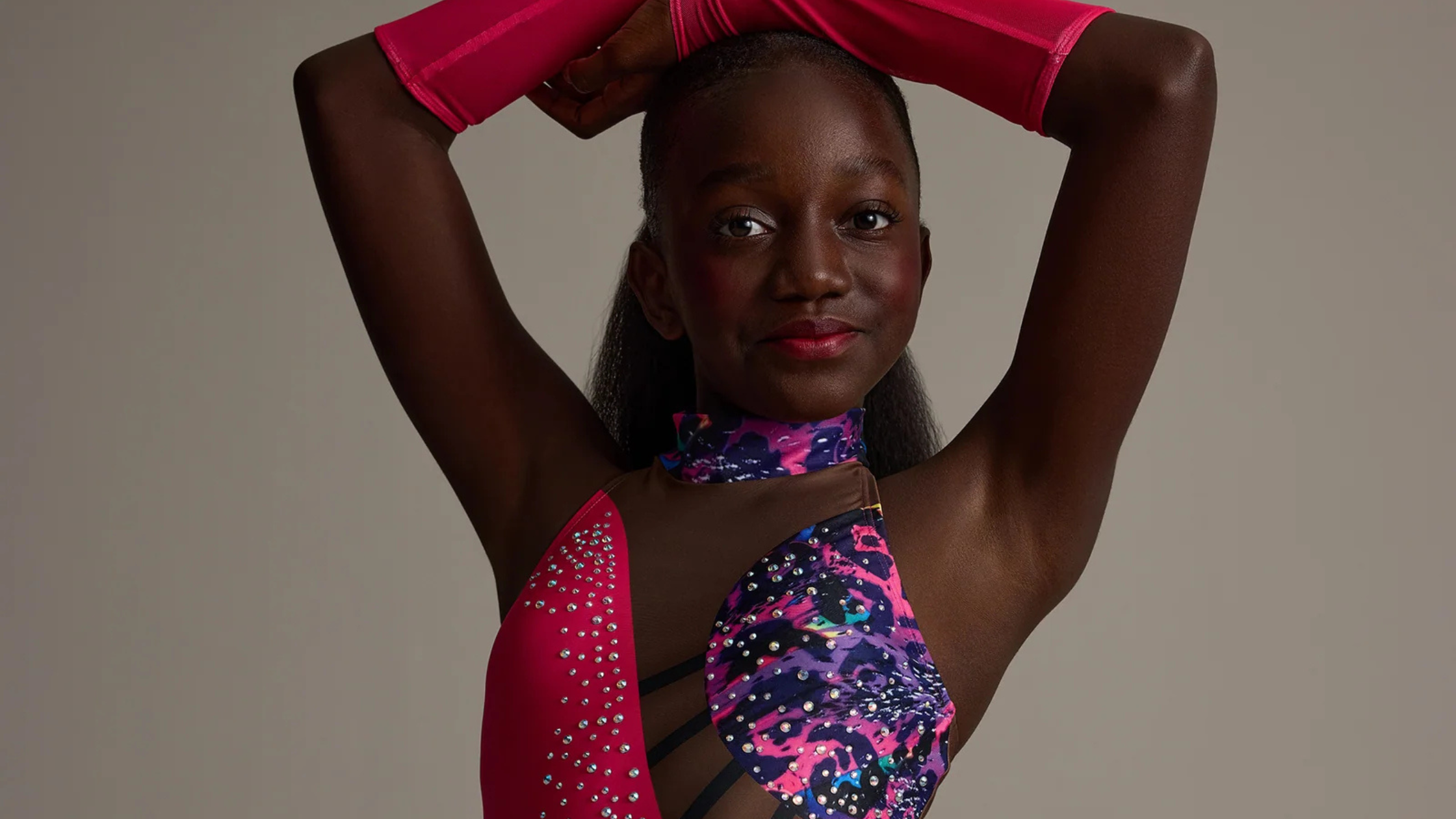
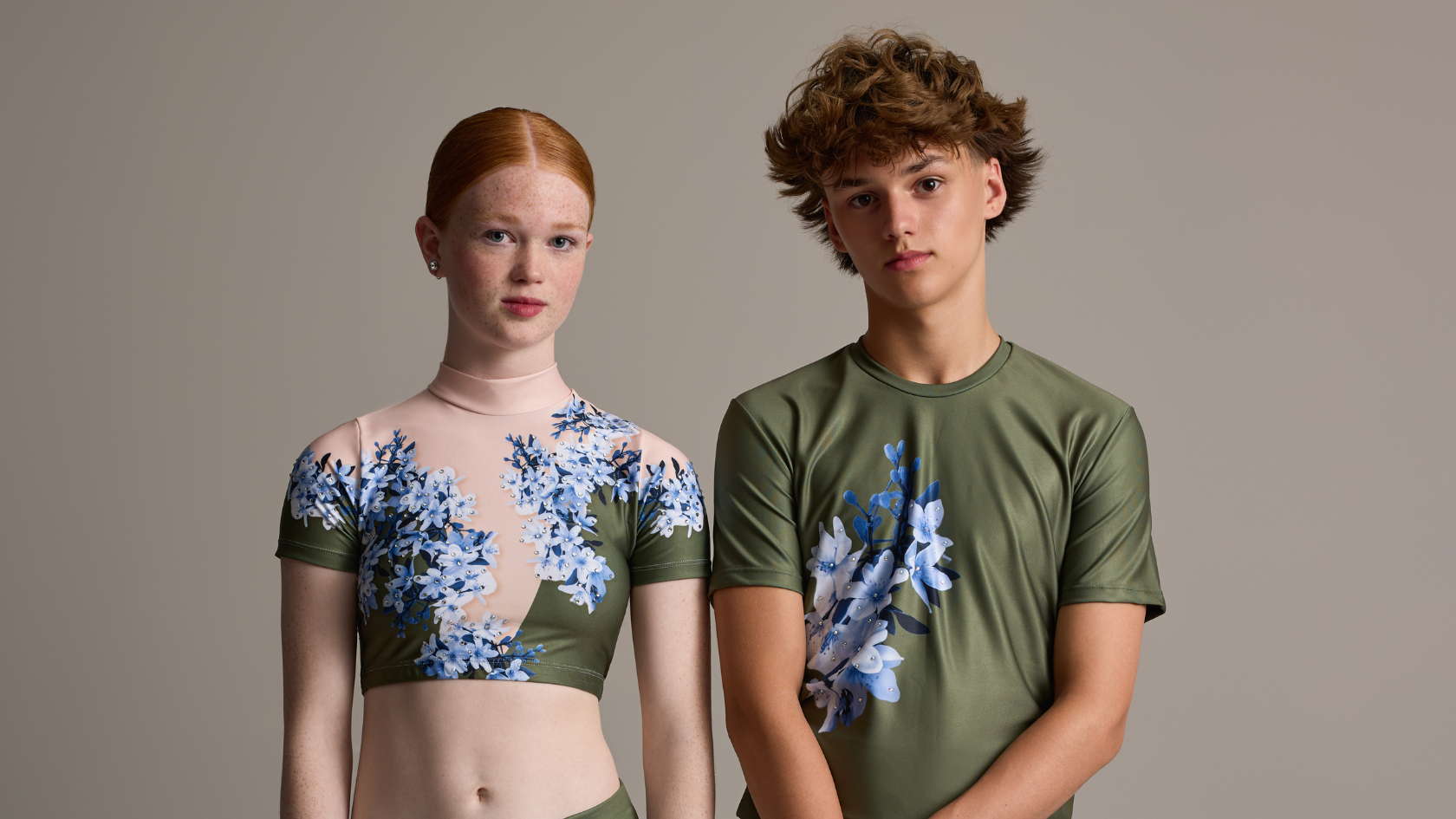
Match palettes to common skin tones (for cohesive, inclusive casts)
Your ensemble likely includes a range of undertones. Choose a base family that flatters the most tones on stage, then allow micro-variations within the same aesthetic. Example: jewel “emerald” for the majority, “teal” or “peacock” for dancers who glow in slightly cooler greens. In our system, Elements’ 32 colors and 4 patterns align with Prima looks, so you can keep the theme while customizing the exact hue for each dancer or subgroup.
Fast pairing ideas teachers love:
-
Deep complexions: saturated jewel tones (emerald, cobalt, plum), metallic gold accents.
-
Olive/medium: teals, berry, forest; mixed cool/warm prints; rose-gold stones.
-
Fair/light: cobalt, crimson, plum, bright pinks; silver crystal highlights for lift.
-
Across the team: consider a neutral anchor (jet black, ivory, slate) in strategic panels to create body definition and clean lines.
Tip: If your studio performs under a blue-heavy LED wash, bump warmth in the palette (coral/berry/gold accent) to avoid looking chilly.
Genre-by-genre color strategy
Jazz: punchy contrast that reads from the back row
High energy loves clear, saturated contrasts and a few strategic sparkle hits.
Palette ideas (teacher-ready):
-
Power Pink & Lemonade — electric, playful, and impossible to miss. Use pink as the dominant field with Lemonade piping; with added crystal clusters on the sternum to catch staccato accents.
-
Azure & Volt — crisp and modern. Let Azure carry the silhouette and pop Volt in the strap details, to sharpen shapes on hits.
-
Teal & Seafoam — sophisticated but still high-visibility. Keep Teal as the base and use Seafoam for edge lines or geometrics so turns and level changes read cleanly.
-
Sassy Surge (Prima Collection) — a standout jazz silhouette that is set beautifully in the palettes above.
Placement tips:
-
Create value breaks (belt, side panel, or neckline) so judges’ eyes track your musical accents.
-
Concentrate rhinestones where the movement peaks—sternum, hip line, cuffs—rather than scattering them evenly.
-
If your venue runs cool LED wash, lean a touch warmer in the accent (Lemonade or Volt) to keep skin tones lively.
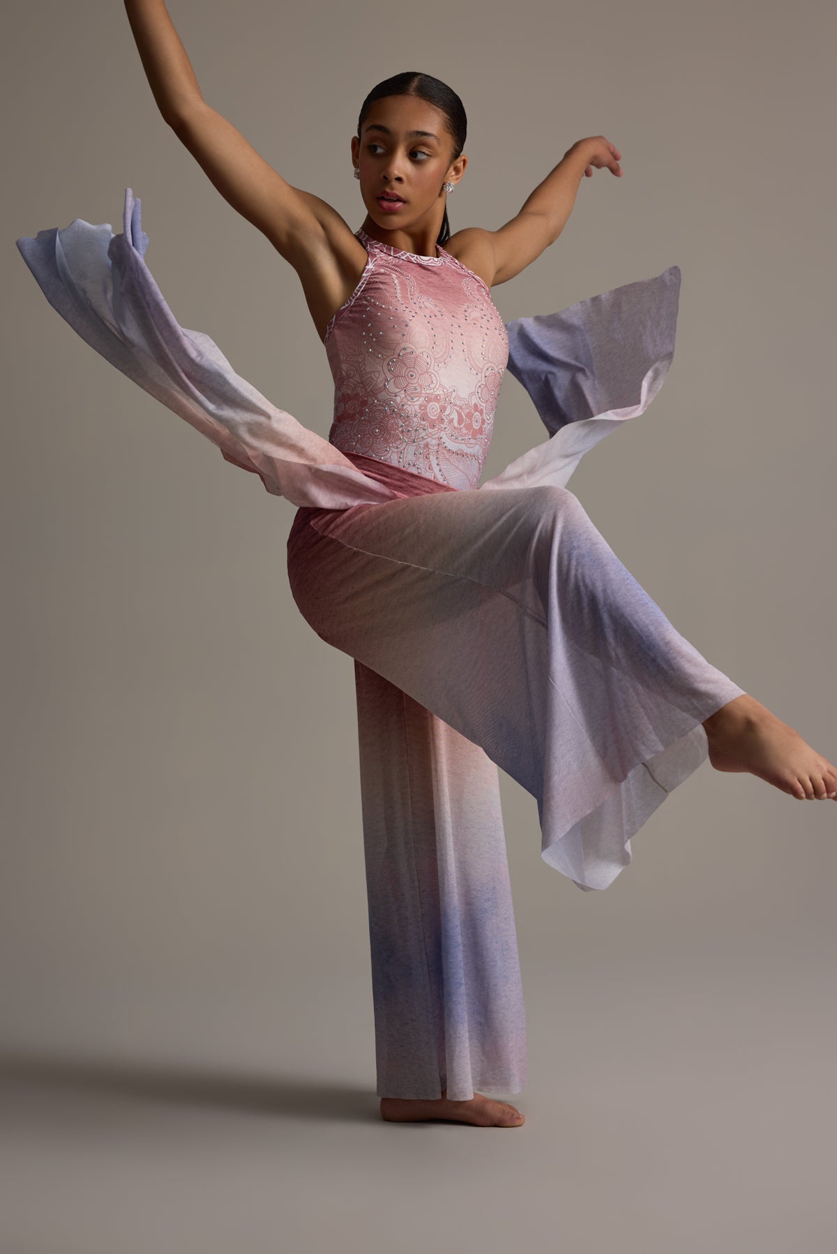
Lyrical/Contemporary: Airy movement wants tonal gradients and subtle sparkle. Pair blush/ivory or soft violet/orchid, then cluster stones at the sternum and forearm to emphasize breath and reach.
Hip Hop: Commanding silhouettes pop in clear primaries and metallics. Navy + volt accent, or black base with tangerine/apricot linework. Keep rhinestones focused (logo/shoulder) so the fit and texture do the talking.
Acro: Choose colors that keep lines readable in inversions. Peacock/teal with a bright high-cut outline, or rich plum with silver edge taping. Avoid mid-value heather tones that blur legs and arms.
Tap: Crisp, legible contrast helps feet read. Black + canary or white + crimson with a strong center line. Rhinestones on cuffs draw attention to rhythmic accents.
Ballet: Classic doesn’t mean pale. Pastel pink works when framed by deeper accents (plum ribboning, antique gold stones). For neo-classical, try slate/ivory with a subtle shimmer panel.
Black, white, and the “invisible” problem
-
All-black can flatten shapes under dim wash. Solve it with value breaks (sheen, mesh, rhinestone gradients, glossy piping) at waist/shoulder lines.
-
All-white/ivory risks glare. Ground it with a contrasting belt or patterned panel; add selective stones so highlights don’t blow out in photos.
Metallics & rhinestones: how much is actually visible?
A little goes a long way—if you place it where movement peaks.
-
Clusters at focal points (sternum, hip, wrist) read better than random scatter.
-
Mix sizes (SS16+ SS20) for dimensional sparkle.
-
For budget control, embellish one anchor piece (bodice) and let Elements mix-and-match pieces carry the color story around it.
Build with Prima + Elements: a teacher’s shortcut
-
Start with a Prima look for the hero silhouette (coverage options + skin tones available).
-
Extend with Elements pieces in coordinating colors/patterns: sleeves, overskirts, shorts, or alternative tops for different casts.
Teacher Toolkit Checklist
Color Picker Cheatsheet
-
Genre? ________
-
Stage wash type (cool/warm/mixed)? ________
-
Base hue that flatters most cast members: ________
-
Value contrast (lighter/darker curtainsl) location: ________
-
Metallic/rhinestone focal point(s): sternum / hip / cuff / neckline
-
Alternative hue for dancers who need it (same family): ________
FAQ
Q: What if my group has wildly different undertones?
A: Keep one theme, then swap micro-variants (e.g., teal ↔ emerald) and unify with identical belts and stones.
Q: Can I mix patterns with solids?
A: Yes—limit pattern to 30–40% of the surface area and repeat the solid color in trims to avoid visual noise.
Q: Will rhinestones fall off?
A: We place stones on low-friction zones and test adherence for performance movement; plus we include a few extra stones for touch-ups, just in case.
Send us your routine style + cast details, and we’ll recommend three stage-proof costumes that make your dancers shine!
Read more
Outfitting male dancers has been challenging due to limited, mismatched options. Limelight Costumes solves this with the Prima Collection, offering coordinated male and female designs, and the Elem...
If you’ve ever noticed that a Limelight costume feels different, that’s intentional. Designed by President and Head Designer Erika, who brings over 20 years of custom costume experience, every Lime...